- Feb 28, 2024
Sparkline Horizontal Axis Technique in Excel
- Neale Blackwood
- Formulas, Tips & Shortcuts, Charts
- 0 comments
Sign up to hear about free Excel training.
I won't share your email with anyone.
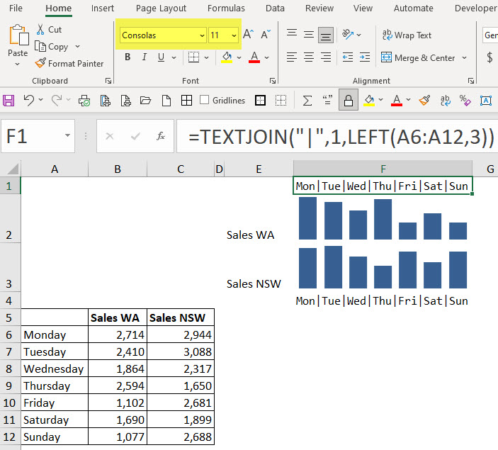
In the image below we can see the solution and the formula in the Formula Bar from cell F1.
You can download the example file at the bottom of the post.
This helps the reader relate the column to the day.
The formula in cells F1 and F4 is.
=TEXTJOIN("|",1,LEFT(A6:A12,3))
The TEXTJOIN function enables you to combine text from a range. Because we used the LEFT function, we are combining the first three characters from each day from the range A6:A12.
The delimiter character (the first argument in the TEXTJOIN function) is what is called the “Pipe” character. This separates the three letter cell entries from the range. The "Pipe" character key is under the Backspace key and you use the Shift key to select it.

I have used the Consolas font with 11 as the font size.
Hat Tip tip to Diarmuid Early on LinkedIn for suggesting this font.
Months example
Here are a couple of other examples using months.
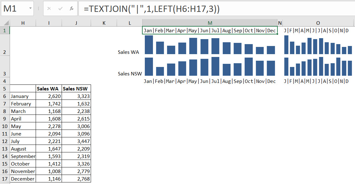
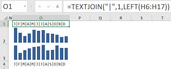
As you can see, we can use either three characters or one to display the month name depending on the width available.
The formula in cell M1 is.
=TEXTJOIN("|",1,LEFT(H6:H17,3))
The formula in cell O1 is.
=TEXTJOIN("|",1,LEFT(H6:H17))
If you have a series of Sparkline charts one above the other, then having the axis above and below can improve the readability.